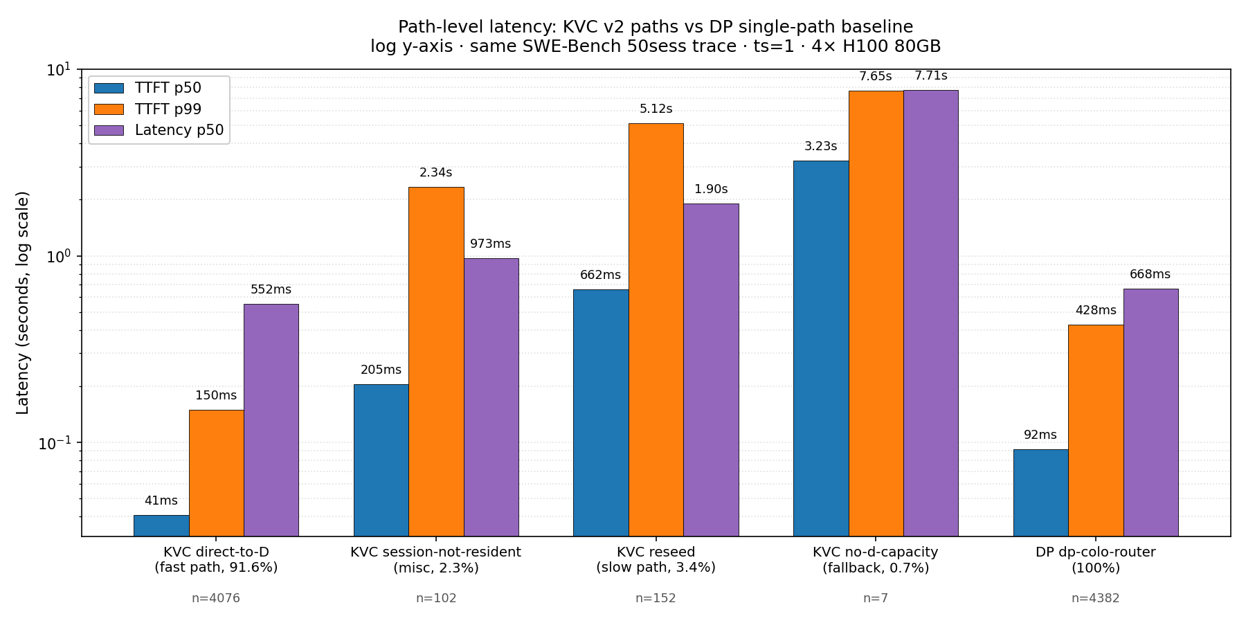
V2_DEEP_ANALYSIS §3.1 (execution_mode distribution) and §3.2 (path-level
latency vs DP) had hand-typed tables with approximate latencies (e.g.
"~1.0s") and required readers to mentally compare 5+ rows × 5 columns.
Both sections now reference generated PNG figures derived directly from
the v2 + DP metrics.jsonl files.

§3.1 figure (v2_execution_mode_distribution.png):
  Horizontal bar chart, log x-axis. 4076 direct-to-D fast-path requests
  (green) dwarf the rest by ~30x; the long tail of slow / fallback /
  failure modes is visible at one glance. Counts and percentages
  annotated on each bar.

§3.2 figure (v2_path_level_latency.png):
  Grouped bar chart, log y-axis. Per-path TTFT p50 / TTFT p99 / Lat p50
  with exact numeric labels (no more "~1.0s" approximations). Sample
  counts annotated below each path. Quick visual reads:
   - KVC fast path TTFT p50 41ms vs DP 92ms (2.2x faster)
   - KVC reseed TTFT p99 5.12s vs DP 0.43s (12x slower) -- the cost
   - KVC no-d-capacity TTFT p99 7.65s (worst case)

Bundled:
- scripts/analysis/plot_v2_path_breakdown.py -- the script that
  generates both figures; rerunable when v2 data changes.

Co-Authored-By: Claude Opus 4.7 (1M context) <noreply@anthropic.com>
106 KiB
1800x900px
106 KiB
1800x900px